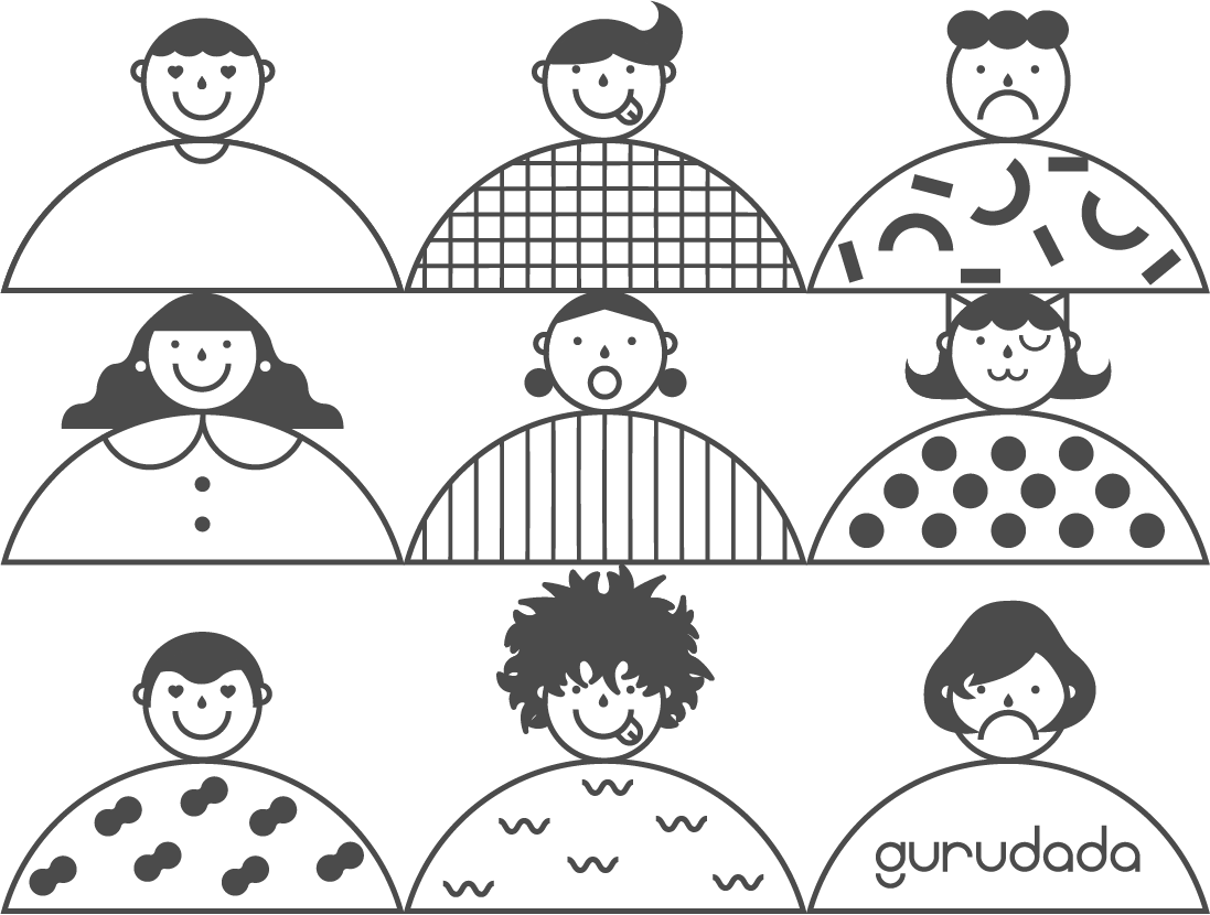
Gurudada is both an innovative technology platform and a means of reconnecting to a simpler, richer, and more social way of living. Our brand reflects that dual role, and these guidelines are a resource for the creation of branded content and products. The design elements, visual style, and narrative voice we’ve developed over the last several years are an important part of the Gurudada project—an important part of our identity, our way of working, and our way of connecting to each other and our community.
The Gurudada logo is bold and playful, combining the narrative conveyed by its sequence of icons with the inviting, tech-inspired visuals of the title. It symbolizes our attitude and perspective: be bold, be human, be present.
The word logo is shortened and simplified, with the icons removed. It is for formal use and official documentation—places we need to indicate brand presence without promising the enjoyment and possibility offered by the app itself.
Our symbol is a reminder. A sharp, distinctive abbreviation of the full and inviting complexity offered by the primary logo. It is used where the full logo can’t fit or doesn’t match the visual environment, preserving our brand identity and offering needed flexibility.
For many users, the app icon will be their first interaction with our brand. It is important that we use this version of the logo in those contexts, where its symmetry and balance will fit user expectations of quality and neutrality.
Our secondary palette is robust and vibrant, offering depth to our marketing communications and product UI. The secondary colors are meant to support our primary Blurple, therefore minimizing usage and hierarchy should be considered when being used.
The first thing you’ll notice here is what our colors aren’t. They’re not bright, vibrant tones that pop off the screen, and that’s because we aren’t trying to keep your attention here. We want you dreaming of what’s out there, and taking exciting risks to reach it. That’s why most of our colors are simple, natural, and neutral: grays and whites to give a minimal, nostalgic feeling to our branded content and digital environments. Alongside those comfort colors we then selectively apply rainbow gradients to key pieces of text or other visual elements. The pattern evokes sunlight glinting on a bubble, one of the brightest and most striking forms of nature’s visual magic.
Poppins is a visually quiet font. In comparison to other modern, sans-serif fonts—Helvetica, Century Gothic, Graphik, Neutrif—Poppins stands out for its simplicity and elegance. It also has fewer character elements in the design of each letter, allowing it to more easily convey our messaging without drawing attention to the medium. That matches our philosophy: we want users’ attention on what they’re doing, not how we look.
Our product typeface is Poppins. When Poppins is not applicable or available please defer to the use of Roboto.
Download Poppins: Here
01. Composition should be assertive and direct, without clutter.
02. Positioning and posture should be natural or candid.
03. Natural lighting should be used wherever possible.
04. Models should never be illuminated using front-flash.
05. Portraits should use high key light for color consistency.


To support our high-level design goal of keeping users focused on content—and on each other—we’ve chosen the most widely accepted UI icon system in the world: the Google Material design icons. They are the default icons for the Android OS, and are common in other Google products, perfectly capturing the modern-but-neutral aesthetic we need from our iconography.
Check on design principle by Material Design: Here
1. Shallow user flows. Gurudada is designed to get people off their phones, not keep them there. Always prefer the most direct way of getting them to a given outcome, screen, or function.
2. Keep it compact, with the fewest reusable modules you can manage. Wherever possible, allow one component to serve multiple functions rather than adding additional components.
3. Minimize the visual presence of design components on every screen. We want to let users treasure the potential of the people they’re meeting; the rest is just a tool to get them there.


Living online means being absent from the world around us. It can feel disorienting, and leave us empty and hollow. Social time—real social time—is an antidote to that emptiness, and a return to the world around us. It is coming back to ourselves, a reminder of who we are, what we value, and what really makes us happy. What we’re building here is a doorway, a portal, or a means of transition: an app that we use only long enough to nail down the time and place.
Staying present can be hard work. Social media is addictive, and our phones are always within reach. But being human means embracing that kind of work, and Gurudada celebrates the allure of being alive. Sometimes we need to push ourselves to get off the couch, out the door, and on our way to a better version of our lives, and pushing ourselves like that is a joyful, uplifting, aspirational act. We see this as a goal—we want our work to encourage that feeling, to help our users insist on experiencing the full richness of their lives.
A last night of celebration before leaving home. The romance and promise of a place you’ve never been. The curiosity that pulls us down unfamiliar roads and on unexpected adventures. The delicious excitement of a smile from a handsome stranger.
The thread that ties these experiences together is something quintessentially human, something shared, something social. It’s what Gurudada delivers to every single user, and it’s the emotional core of what we’re trying to achieve.
The other piece of our user experience can be summed up like this: be true to your humanity. Get your feet back on the ground. Appreciate what it means to be right where you are, in this place and with these people. Being in good company is the opposite of being lost: it’s being found again, fitting in, no matter where you are or what you’re doing.

01. Unique: An avatar that stands out even when reduced to just its silhouette.
02. Collaborative: Designed to blend seamlessly when placed alongside any collaboration avatar or logo, without appearing too dominant or out of place.
03. Universal: Appeals to a broad audience: whether printed on a T-shirt, it should feel comfortable and appropriate for everyone, regardless of age or gender.
04. Expressive: Offers a variety of poses and facial expressions suitable for different scenarios, from mobile app showcases to being easily cosplayed or turned into memes or stickers. It effectively represents the "brand voice."